CASE STUDY
Flowers & Flowers offers a full line of floral services ranging from single bouquets to weddings and event designing, and so much more.
The redesign of the Flowers and Flowers website was a solo project. The business is growing and the site needed to have a better layout for their online store.
The owner of Flowers and Flowers also wanted a sophisticated and more up to date look.
DURATION OF PROJECT
Six weeks
MY ROLE
UX Research | UI Design | Wireframing | Prototyping
TOOLS
Adobe XD | Illustrator | Photoshop | Miro | WordPress
CLIENT
Flowers and Flowers – Darien, Connecticut
Overview
UNDERSTAND
Heuristic Evaluation
By using Heuristic Evaluation, I discovered the original responsive website had some issues when viewed on mobile.
Heuristic Evaluation Flowers and Flowers Website on Desktop and Mobile
Flexibility and Efficiency of Use
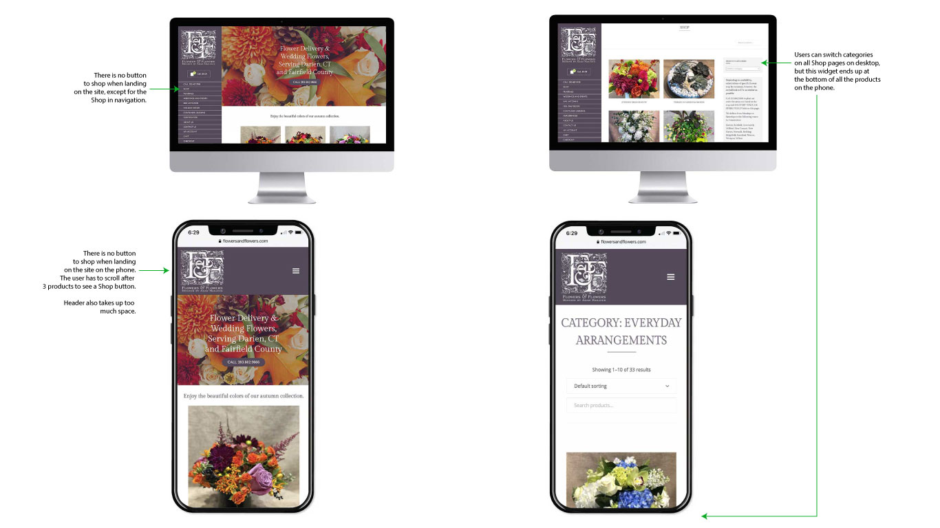
The top header on the phone is too large and takes up too much space.
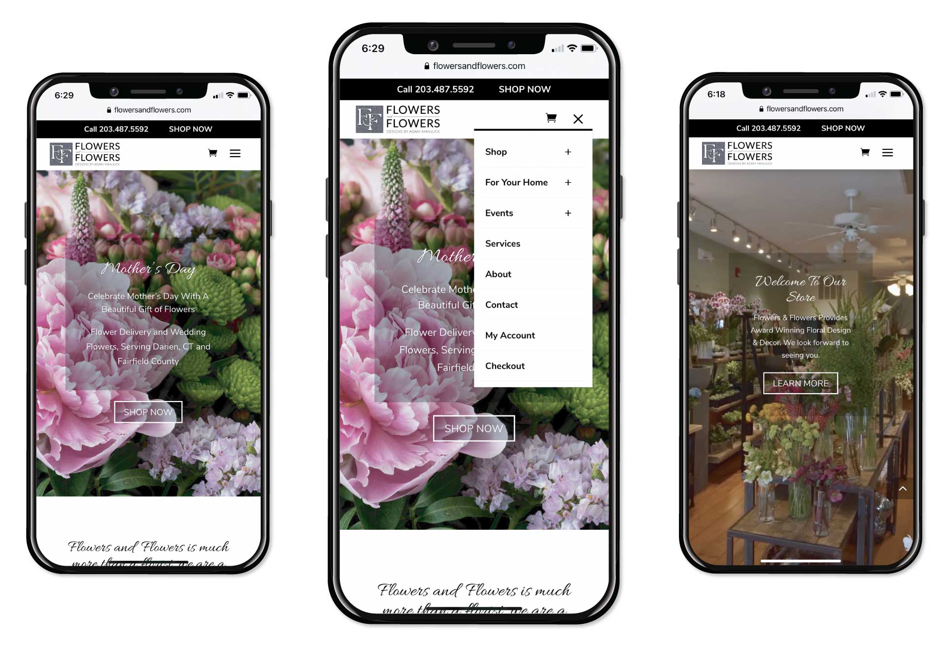
On the desktop, the navigation shows well on the left, but on mobile, the hamburger dropdown menu covers the whole page, it would help to have it only cover half vertically.
Navigation and Placement Issues
When landing on the website, both on desktop and mobile, you just have a “Call” button with phone number. There is no “Shop Now” button that is easy to find. On the desktop you see “Shop Now” in navigation to the left, but it is just amongst all the other navigation items, so it does not stand out. On the phone, you have to hit the hamburger menu to go to the “Shop”. Users have to scroll down quite a bit below 3 products before they see the “Shop Now” button.
When a user goes to the “Shop”, they see the categories, but once they are inside a category viewing products, there is no way to easily go back to the Shop or another category without going back to the hamburger menu in the mobile version. The desktop version works, because the user can see a dropdown menu to go back and forth between the categories.
Match Between the System and The Real World
The shopping cart icon is not showing on mobile.
User Control and Freedom
Adding navigation at top for mobile to go between categories would give the user better control and freedom.
Consistency Standards
The color scheme, fonts, buttons and images are consistent in color, look and feel.
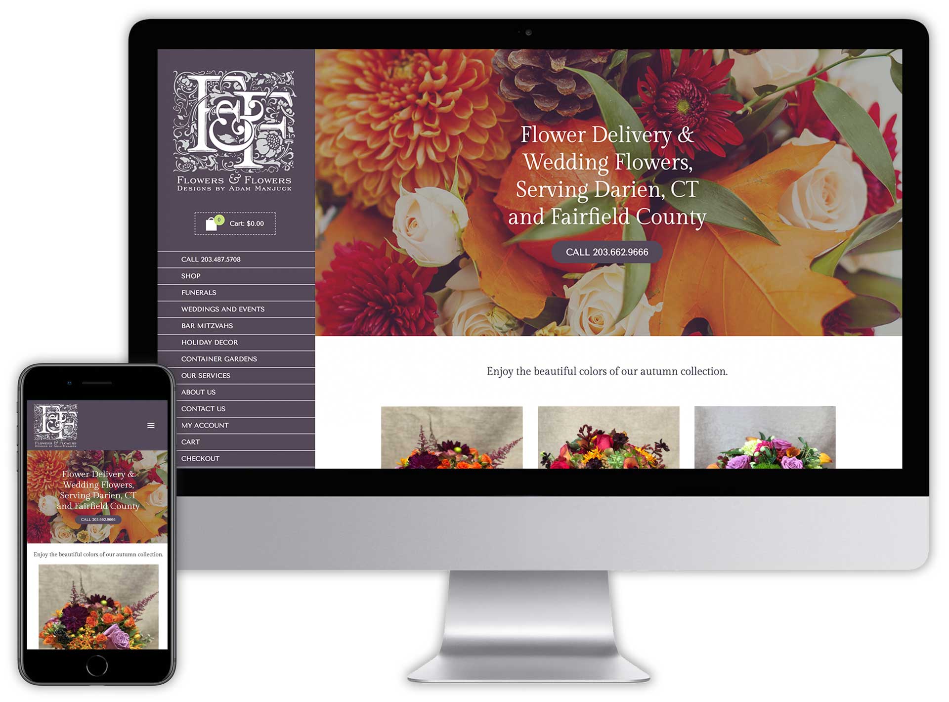
Previous website homepage on desktop and mobile.
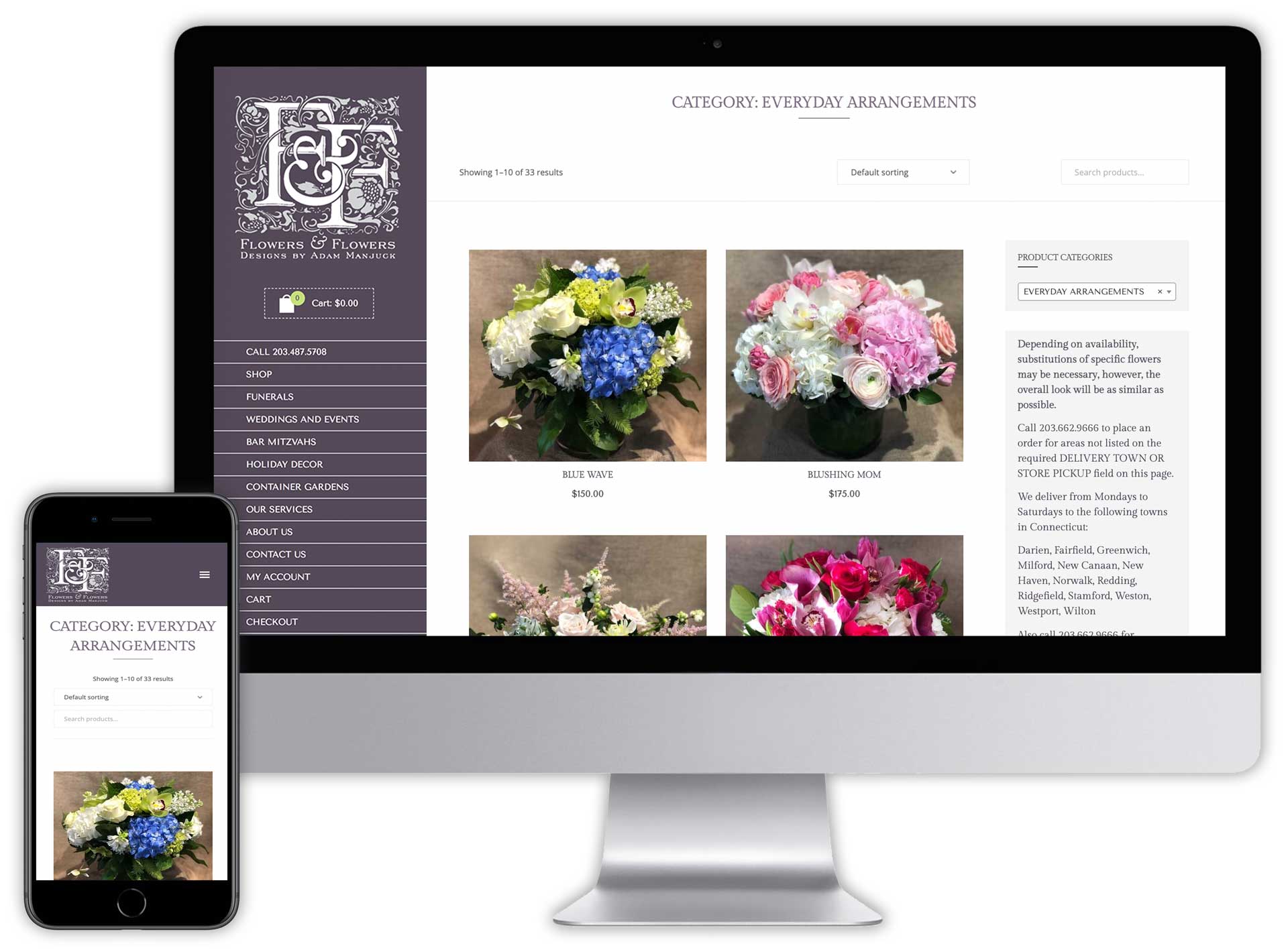
Previous website product page on desktop and mobile. Navigation to go between Categories on mobile was way down at the bottom.
RESEARCH
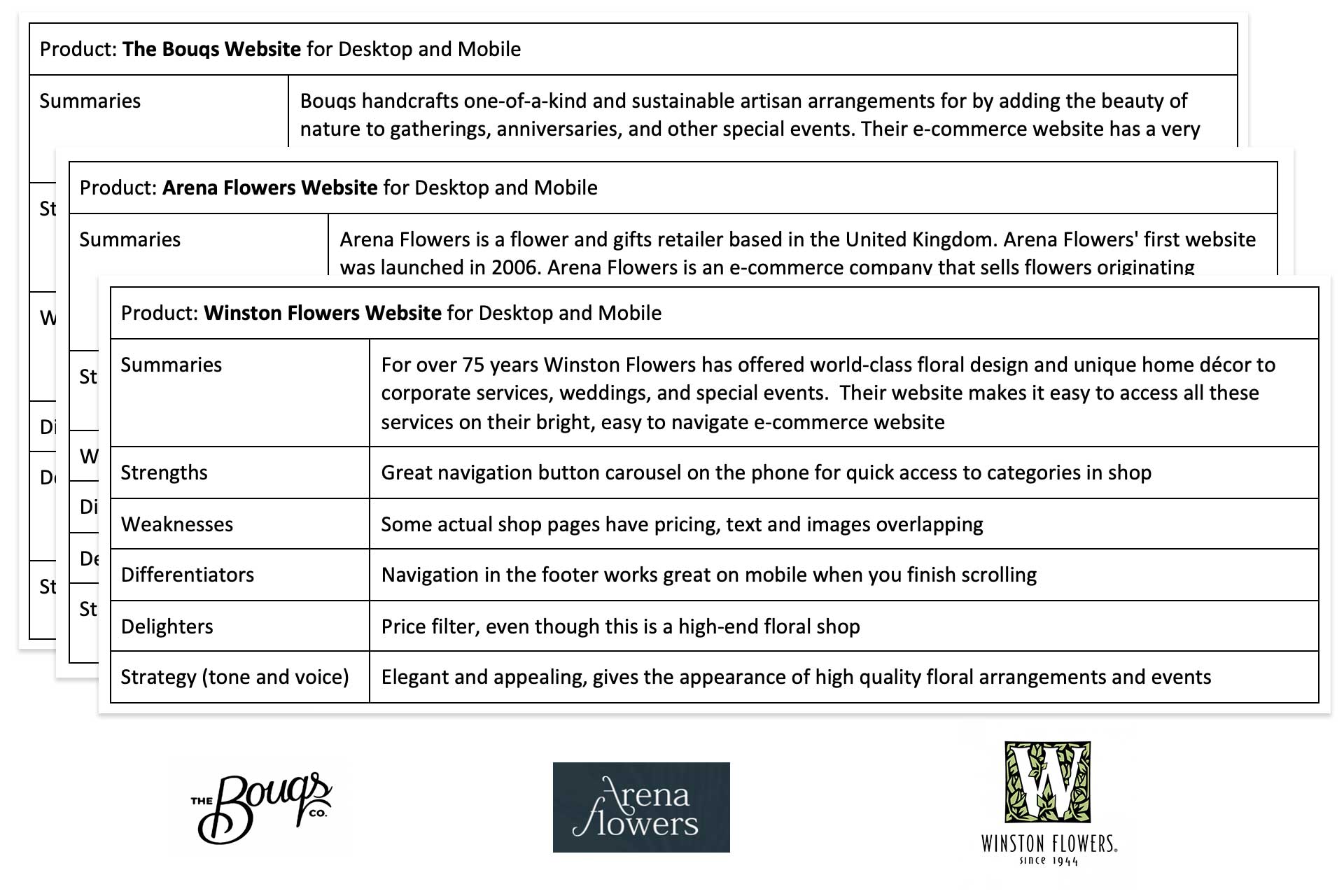
Competitive Analysis
I analyzed 6 other flower shop websites to see what strengths and weaknesses they had and to understand the competing market. Analyzing these other responsive websites made it clear that there were some issues with navigation on the original Flowers and Flowers website when using it on mobile.
RESEARCH
Interviews
I interviewed people both through a survey and on the phone. I found some people only bought flowers once or twice a year, others once a month and others just for occasions. Many indicated how important it was for the flowers to be fresh and to smell great in a room and to be of good quality. People indicated they would be happy with seeing categories with each group of floral arrangements instead of seeing all at once.

Some Questions I Asked
How often do you buy flowers?
How do you purchase flowers today?
Would you prefer a different way to purchase flowers and how?
Why don’t you order flowers online if it is available?
Do you prefer to see delivery cost up front or at checkout when purchasing flowers online?
When landing on a flower shop website, do you prefer to see all the flowers in the shop or the flower categories?
Do you like a pickup or delivery option or both?
Would you consider a flower subscription service?
Do you prefer customized or pre-made flower arrangements?
ANALYSIS
Data Synthesis
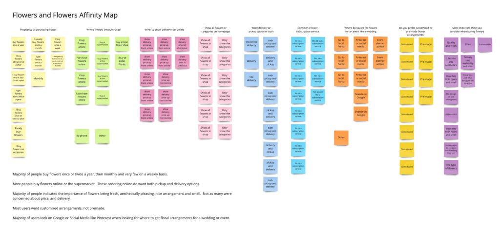
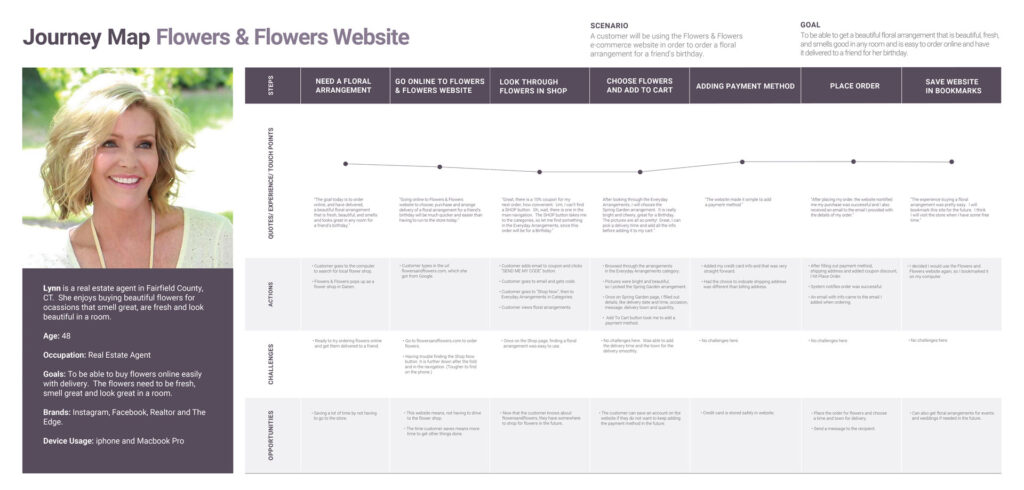
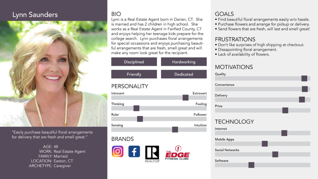
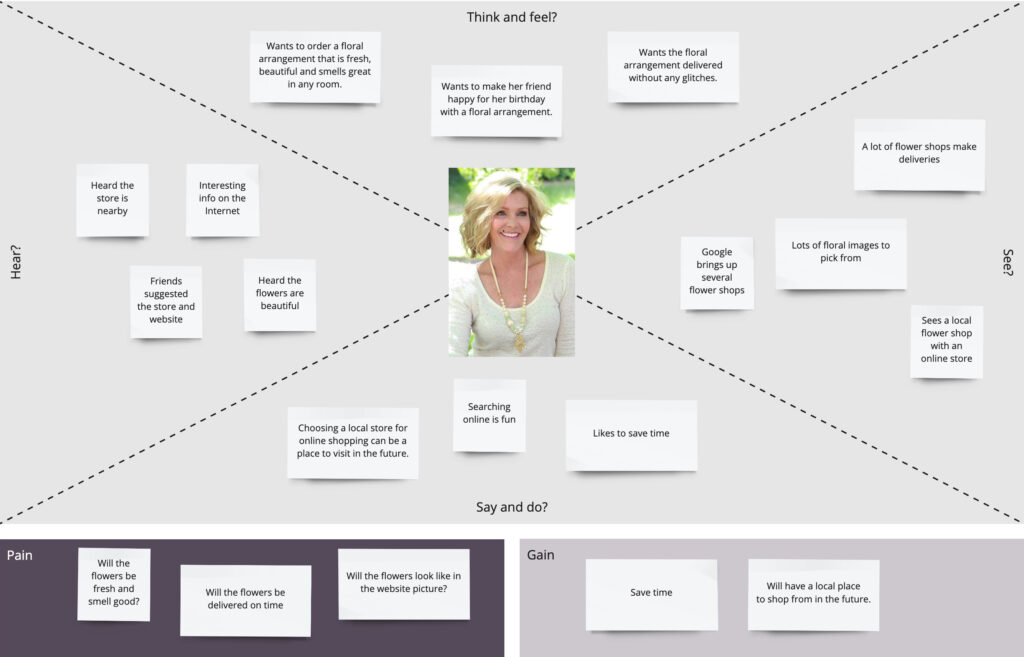
In order to understand the user’s needs when using the website, I took all the information I gathered and began by creating an affinity map. This in turn gave me important user needs and interesting patterns, which helped me put together a persona and empathy map. The journey map allowed me to put myself in the user’s shoes. The information from these gave me the direction to start planning and designing ideas and solutions in order to redesign the website.
Affinity Map
User Journey
Personas
Empathy Map
BRAINSTORMING
Ideation Process
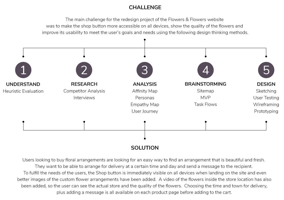
With an understanding of what users were looking for from the interviews, I came up with the following MVPs:
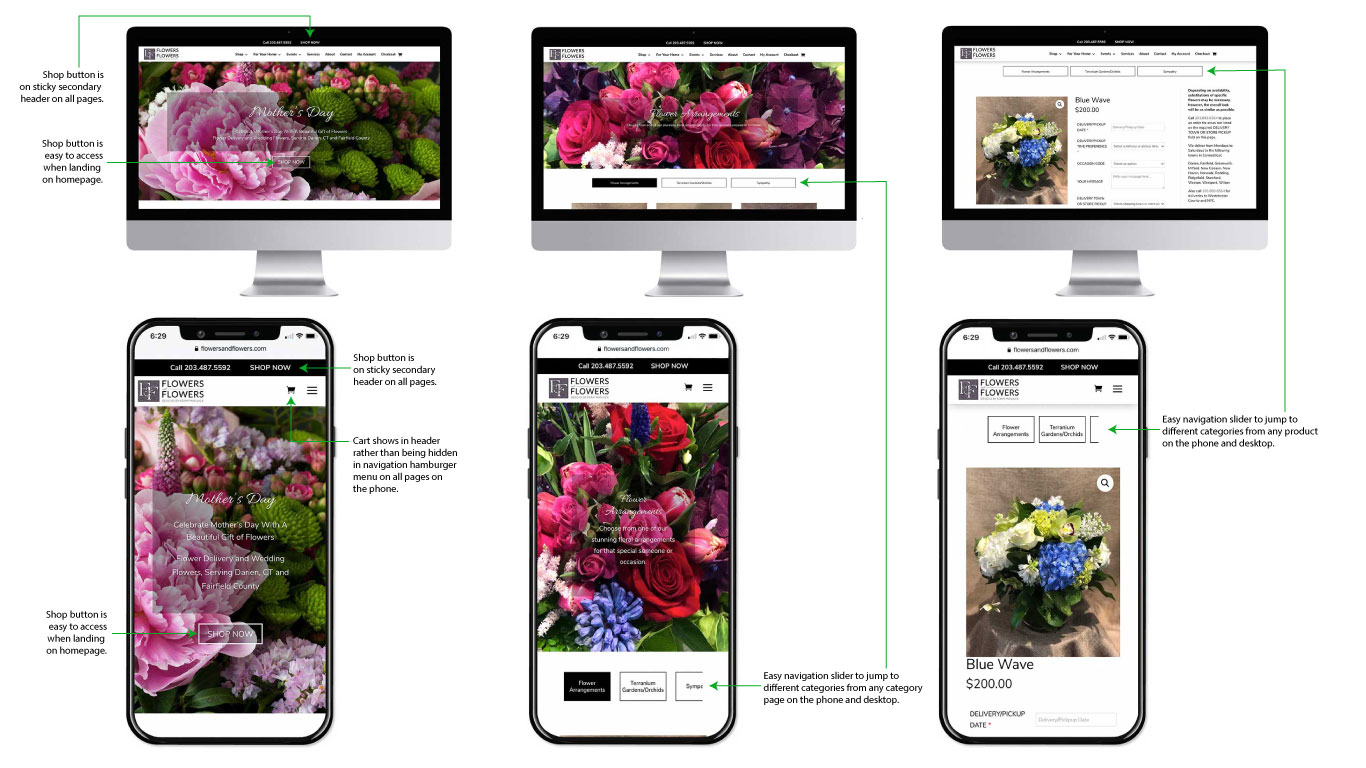
- A “Shop Now” button in the hero section both on desktop and mobile.
- A “Shop Now” button on a sticky header that would show on all devices to make it easy to see the store from any page.
- Easy navigation slider on all category pages to allow users to go between flower categories easily.
- Sticky navigation slider on all product pages to easily switch flower categories even after scrolling through many products on mobile.
- A video on the website about the flagship Flower Shop to really show the beauty and high quality of the flowers as much as possible, since freshness, quality and beauty of flowers came up in interviews.
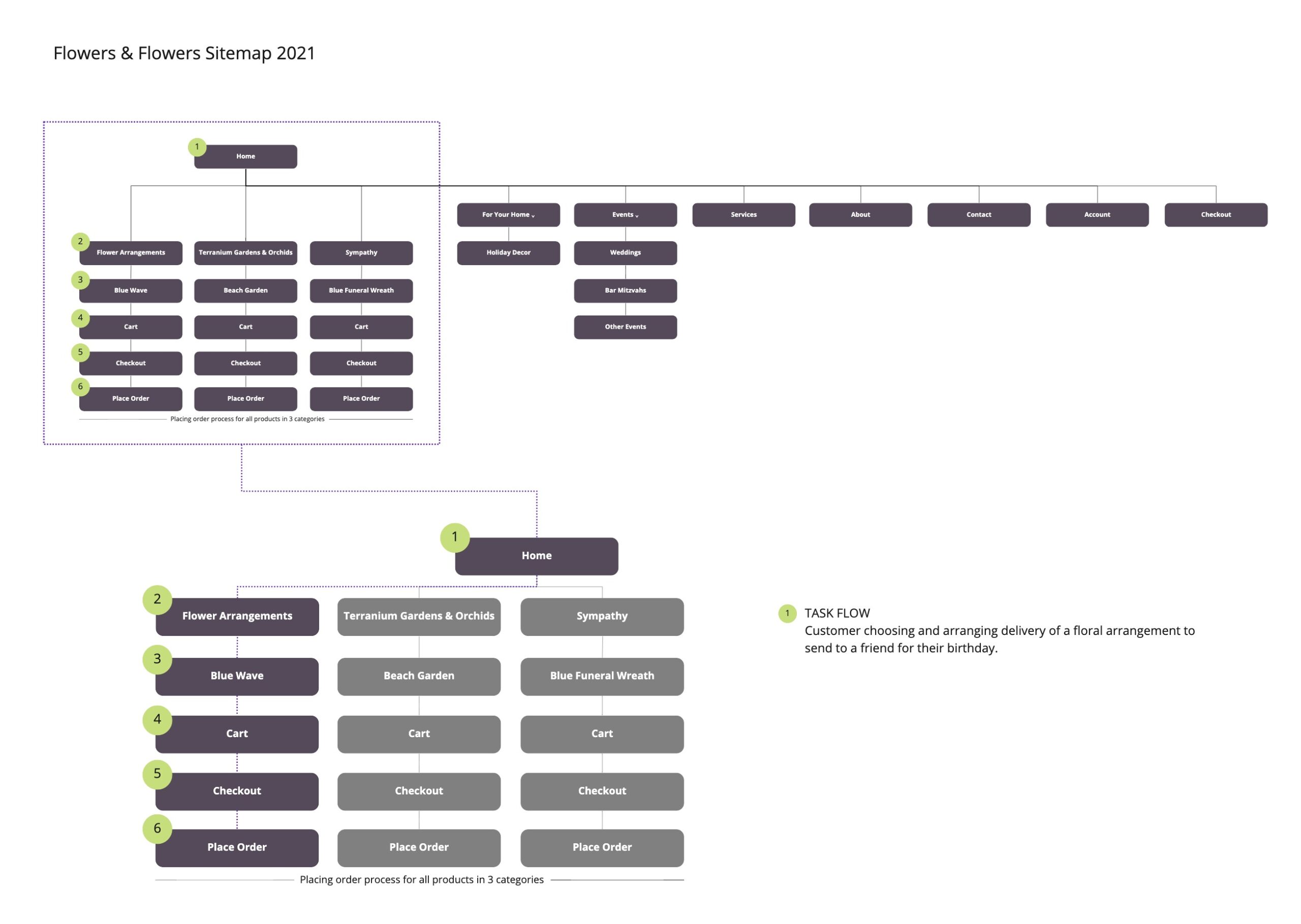
With all this info, I was able to create the sitemap and begin work on task flow and design.
DESIGN
Sketching and Wireframes
With the MVPs and sitemap, I began to sketch paper prototypes showing the Task Flow and corrections to the new site. I tested them with several users and from that testing made some revisions. One major revision was the need of the navigation sliders on every product page, not just on the category pages.
Sketching
Testing
Wireframing
Testing


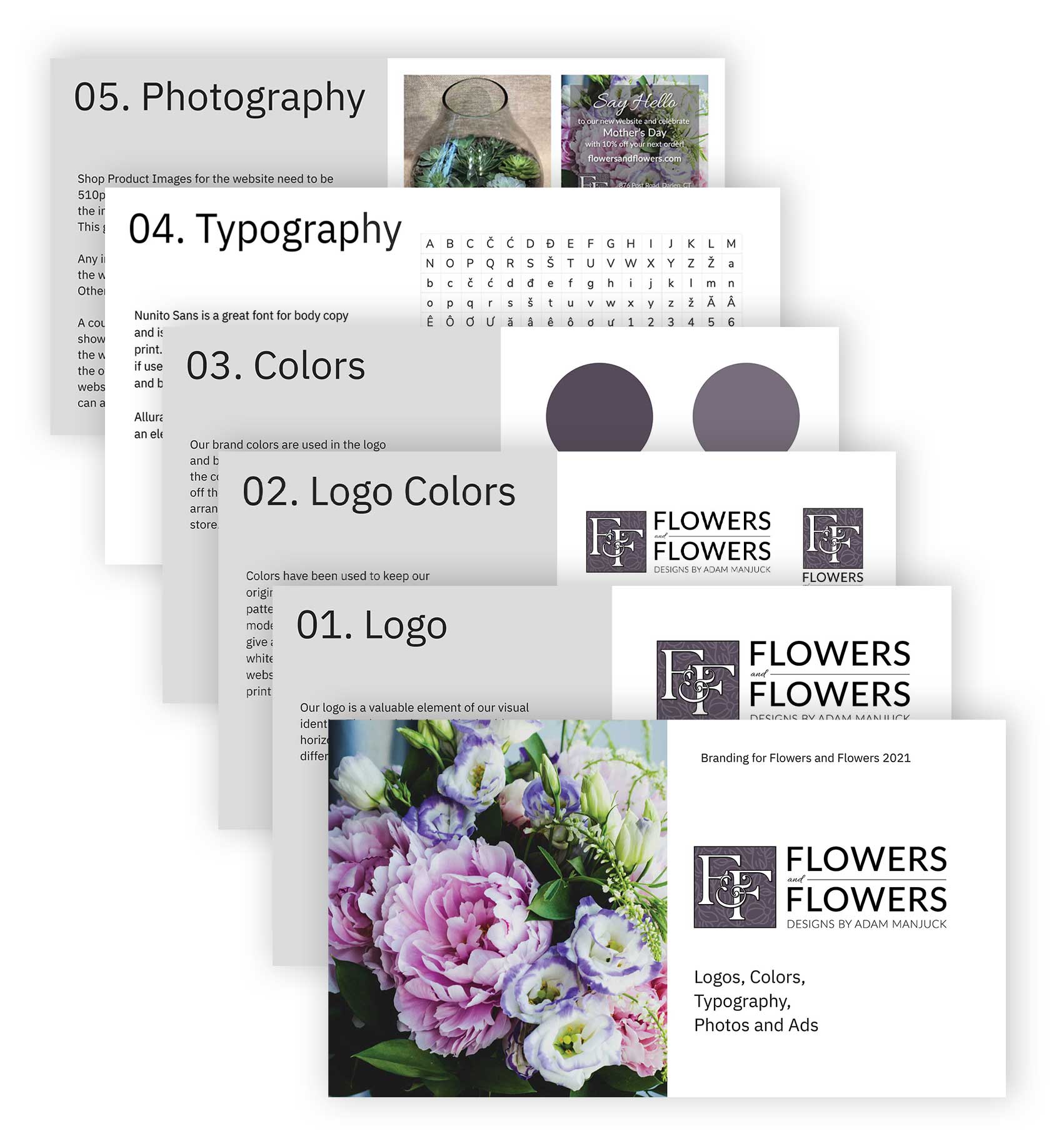
Branding
I created a new branding booklet so that there continues to be consistency between the website, print and social media. The business owner and those driving traffic to the site with social media are now all on the same page.
DESIGN
High-Fidelity Prototype
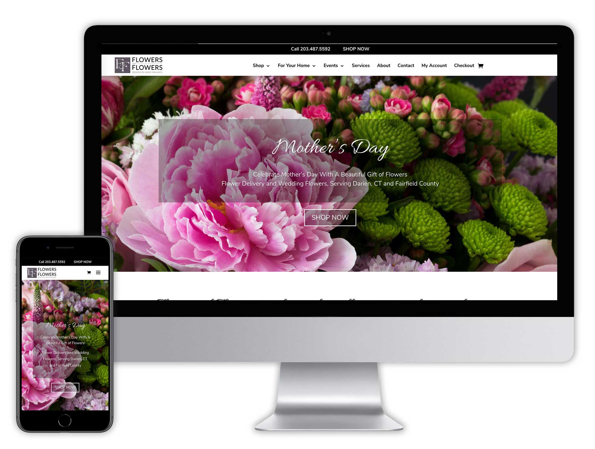
After several revisions, it was important to make sure the website had a fresh look. Even though the site used to have great product images, there was nothing on the website that showed the physical shop located in Darien, CT. Video was shot and added to the website homepage and on the Services page a video with the owner speaking about his business and services inside the shop really gives the users coming to the site an idea of this unique flower shop.
This Task Flow shows how easy it is for a user to be able to place an order going directly from the hero section of the homepage when they land on the site, both on desktop and mobile. The user can also easily use the “Shop Now” button located at the top of the sticky header from every page.

Before
After
Learnings
Putting myself in the shoes of the user and going through the motion of navigating through the site and making a purchase again and again helped. Empathy interviews were crucial! The original website worked better on desktop, but it was still cumbersome for getting to the shop. On mobile, the site really needed help with better navigation. By adding slider navigation to move between categories of floral arrangements and using the slider navigation as a sticky header on the product pages, getting around the website is so much easier for the user now. The interviews were of great help and made it obvious a video showing the shop and the quality of product really helped portray the amazing quality of the flowers coming from this business.