CASE STUDY
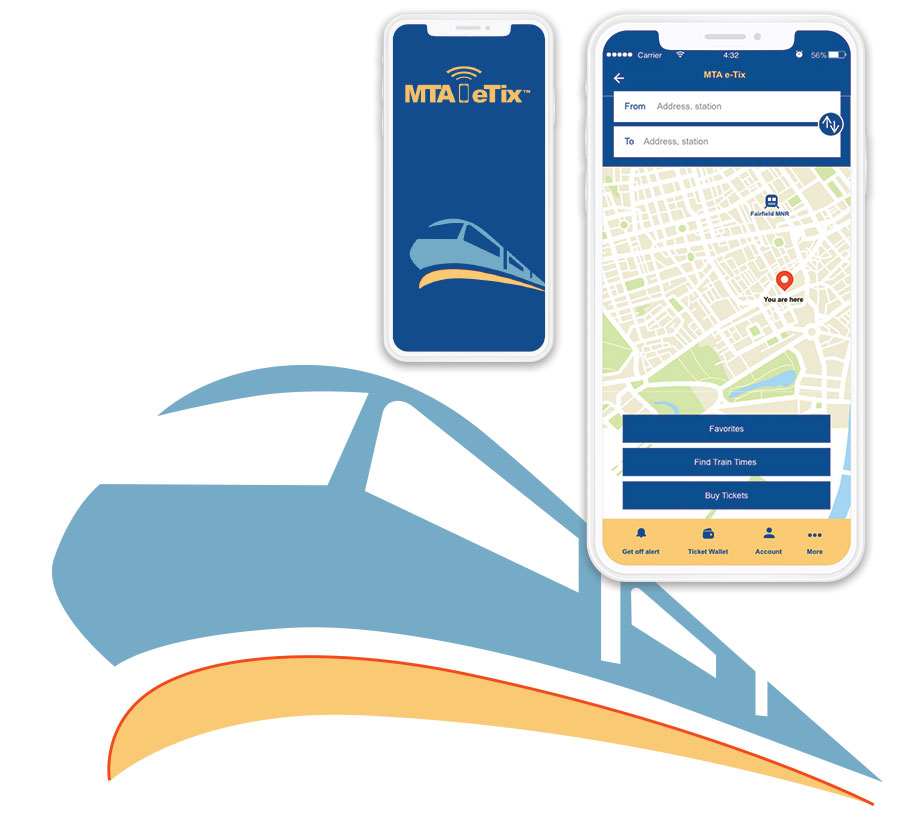
MTA eTix is an app that allows customers on MNR’s Hudson, Harlem and New Haven lines and all LIRR branches to purchase tickets on their phones.
The redesign of the MTA eTix app was a project for the UX Design course at FIT with a team of three people. The project was to revamp the application using design thinking and to understand the importance of research and user-centered design.
DURATION OF PROJECT
Two months
MY ROLE
UX Research | UI Design | Wireframing | Prototyping
TOOLS
Adobe XD | InDesign | Illustrator | Photoshop | Miro
COURSE
UX Design Certification, Fall 2019,
Fashion Institute of Technology
Overview
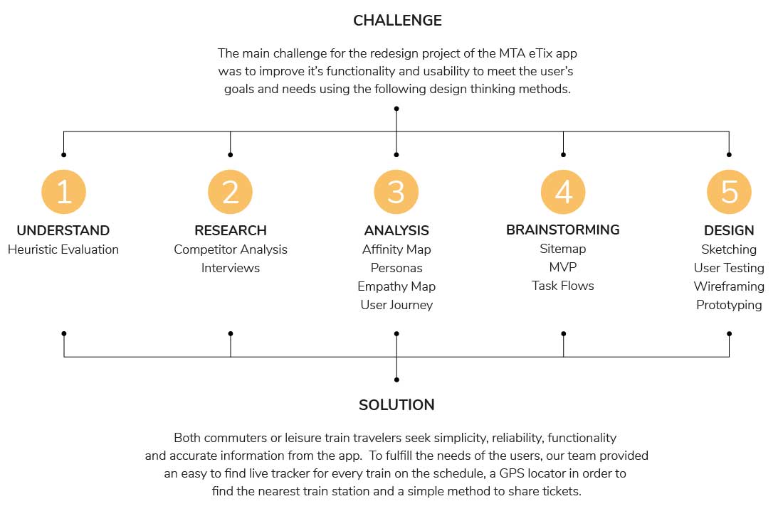
UNDERSTAND
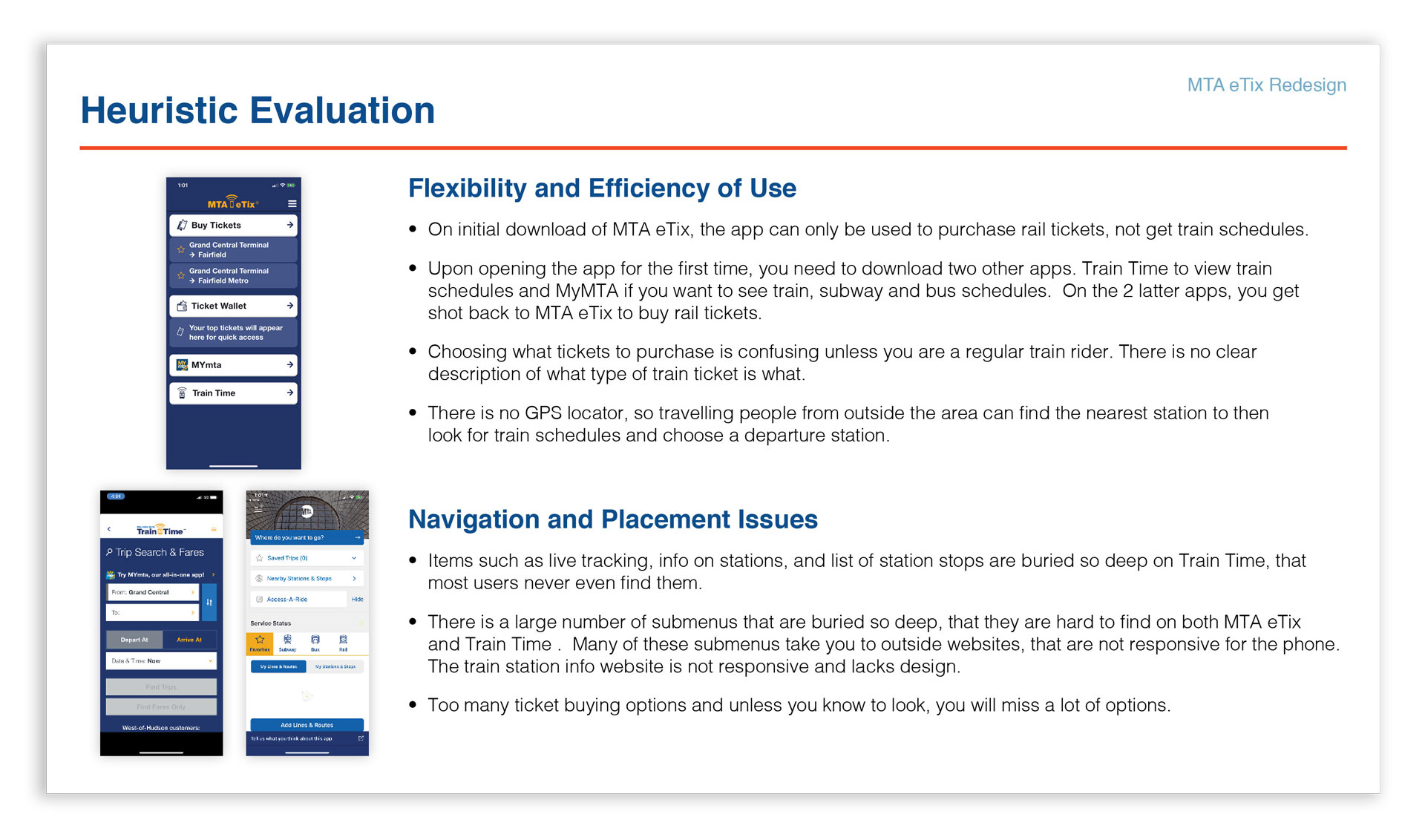
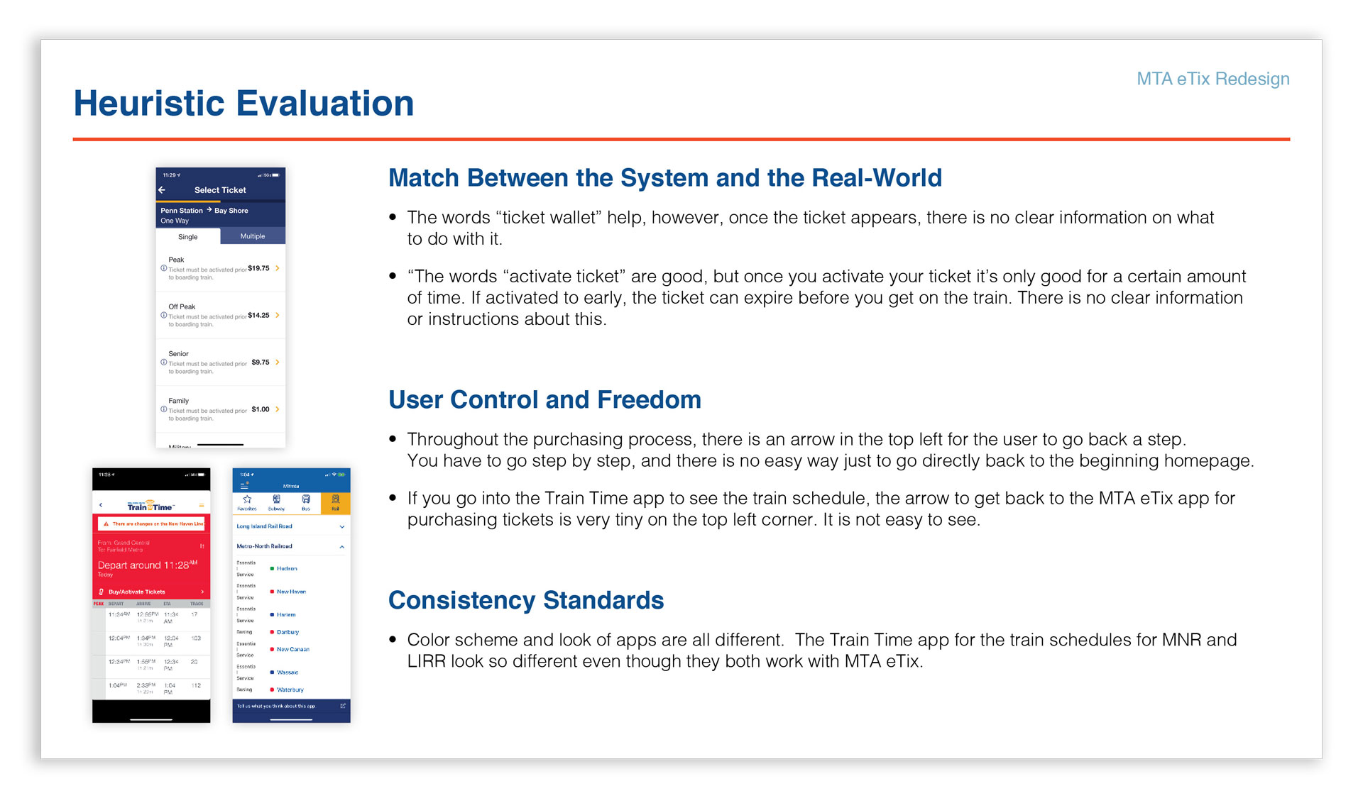
Heuristic Evaluation
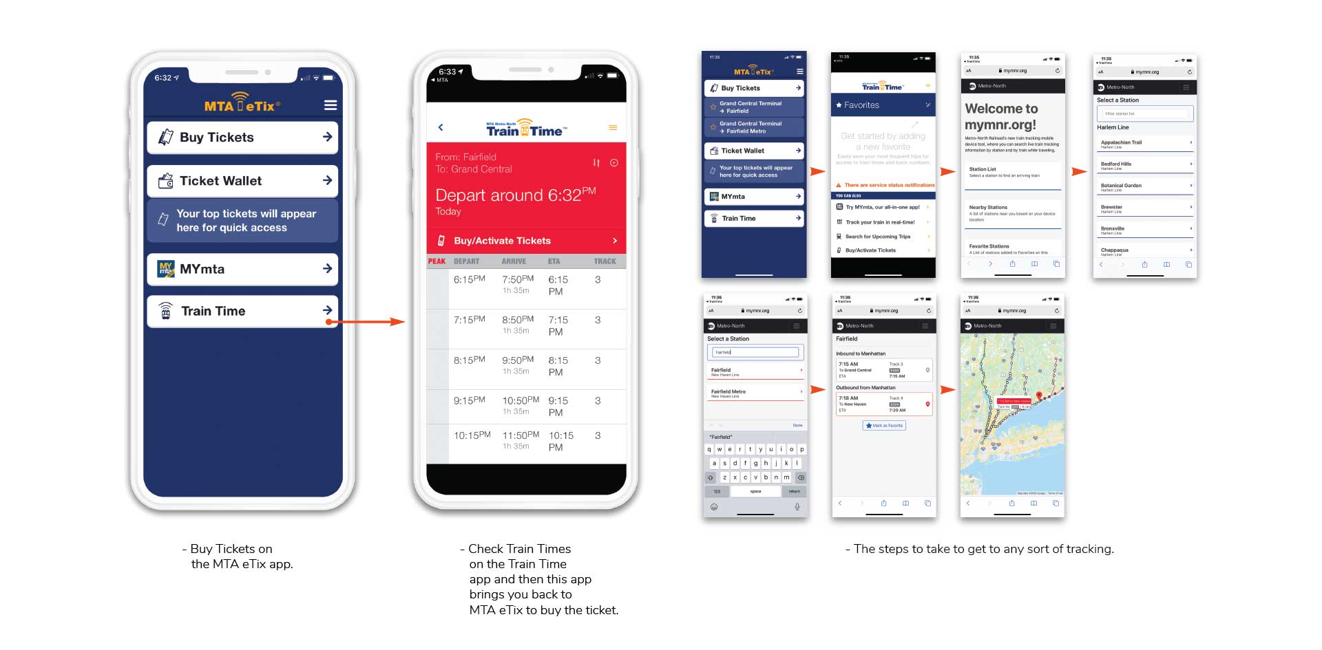
By using Heuristic Evaluation, we discovered the app has several flaws. The app only allows you to purchase tickets on its own and you have to download 2 other apps for more functionality like viewing train times. Live tracking is buried, making it hard to find, and then when you do go through the process the tracker used is dissapointing. So many apps being needed adds confusion, especially since they all use different colors.
RESEARCH
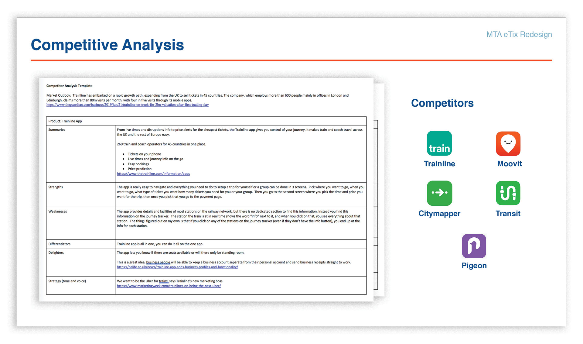
Competitive Analysis
We analyzed five other apps to see what strengths and weaknesses they had and to understand the competing market. Analyzing these apps made it very clear that MTA eTix was only great for buying tickets. Having to download two other apps to get some functionality for viewing train times and having access to a GPS locator made it clear MTA eTix was far behind the competition.
RESEARCH
Interviews
As a group, we performed interviews at Penn Station with commuters traveling both from Long Island and New Jersey into Penn Station, to see what they knew about the MTA eTix app and also to see if they were using it, or not. I also interviewed travelers on the train from Connecticut to Grand Central Station. We interviewed about 15 people ranging from young adults, to middle aged and a couple of seniors. The interviews were interesting and gave us insights into how users use MTA eTix and what other apps they were using to plan their trips.

Some Questions We Asked
What app did you use to buy your ticket?
If you didn’t use the MTA eTix app, why not? Have you ever tried it?
If you use the app, what do you like or dislike about it?
Did you ever use any other apps to help plan your commute like Google Maps or something similar? If so, what?
How often do you travel by train?
Do you commute during the week?
Do you use monthly passes?
Are you traveling for fun?
Did you buy a paper ticket at the booth or machine?
ANALYSIS
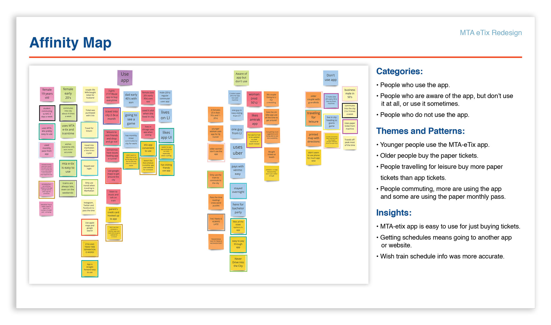
Data Synthesis
In order to understand our user’s needs, frustrations and goals for the app, we took all the information we gathered and began by creating an affinity map. This in turn gave us important user needs and interesting patterns, which helped us put together 3 personas and empathy maps. The journey maps allowed us to put ourselves in the user’s shoes. The information from these gave us the direction to start planning and designing ideas and solutions in order to redesign the app.


Affinity Map
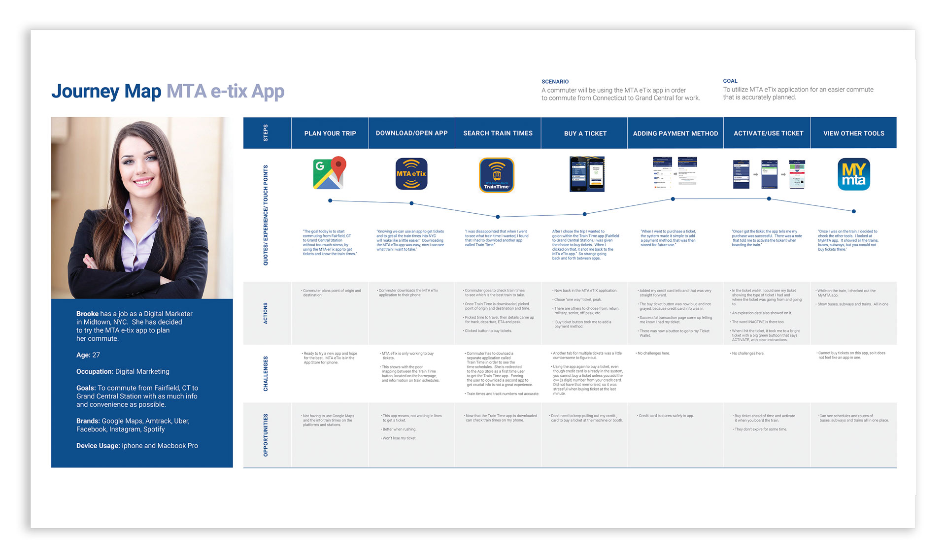
User Journey
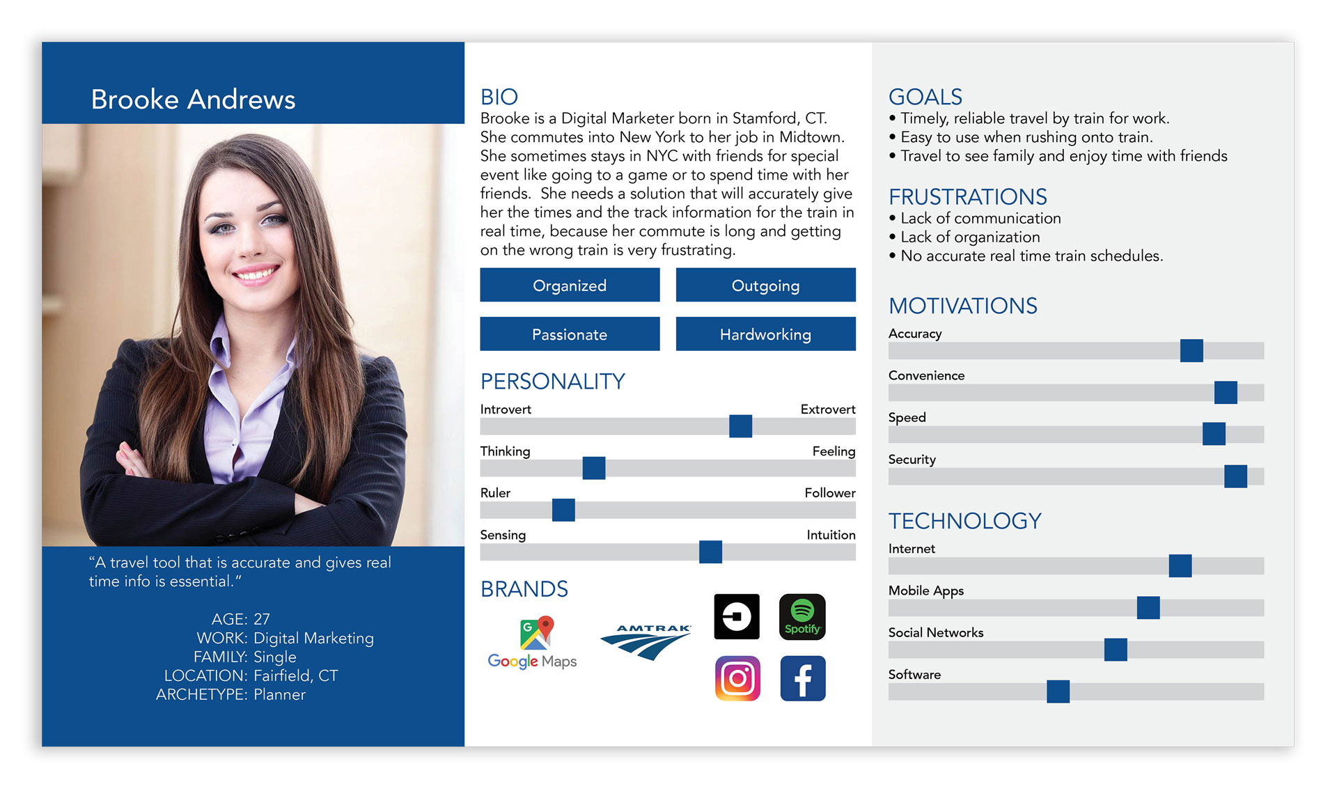
Personas
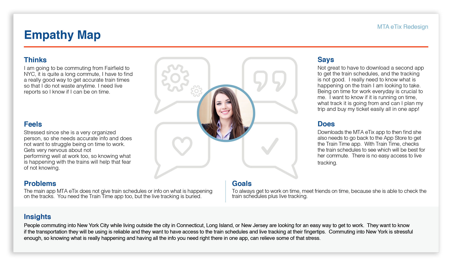
Empathy Map
BRAINSTORMING
Ideation Process
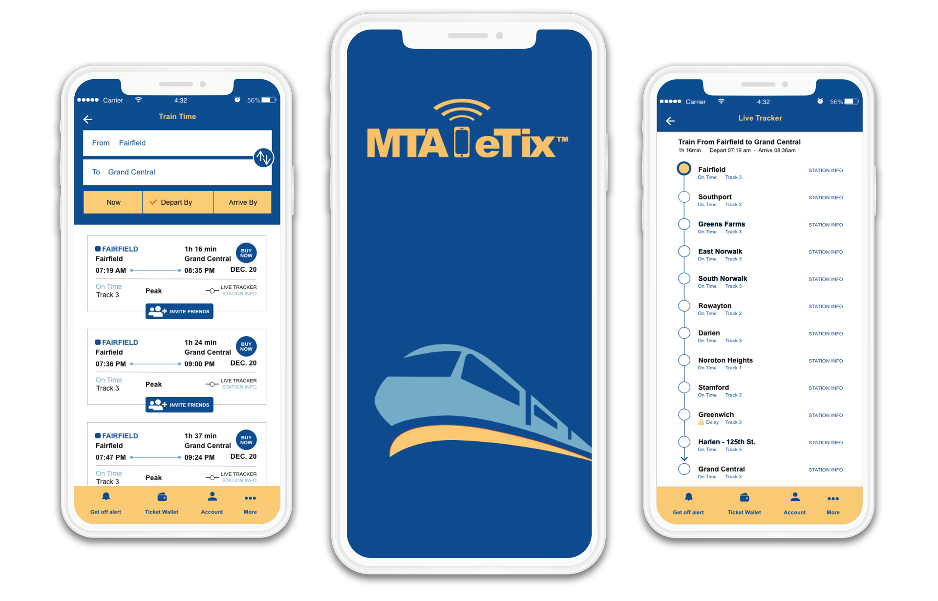
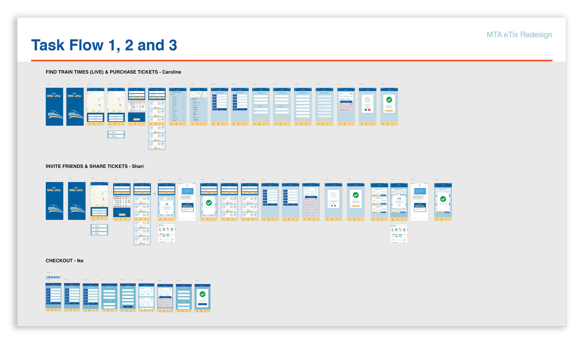
With an understanding of what users are looking for, we came up with the following MVPs. GPS Location to know where you are or what station is near you. Easy way to get train schedules with track and peak or off-peak info including accurate Live Tracking of delays, issues on tracks, etc. Easy access to station info on your path and a consistent look in one complete app that avoids confusion and makes it easy to use. With this we were able to create the sitemap and begin work on three Task Flows.
![]()
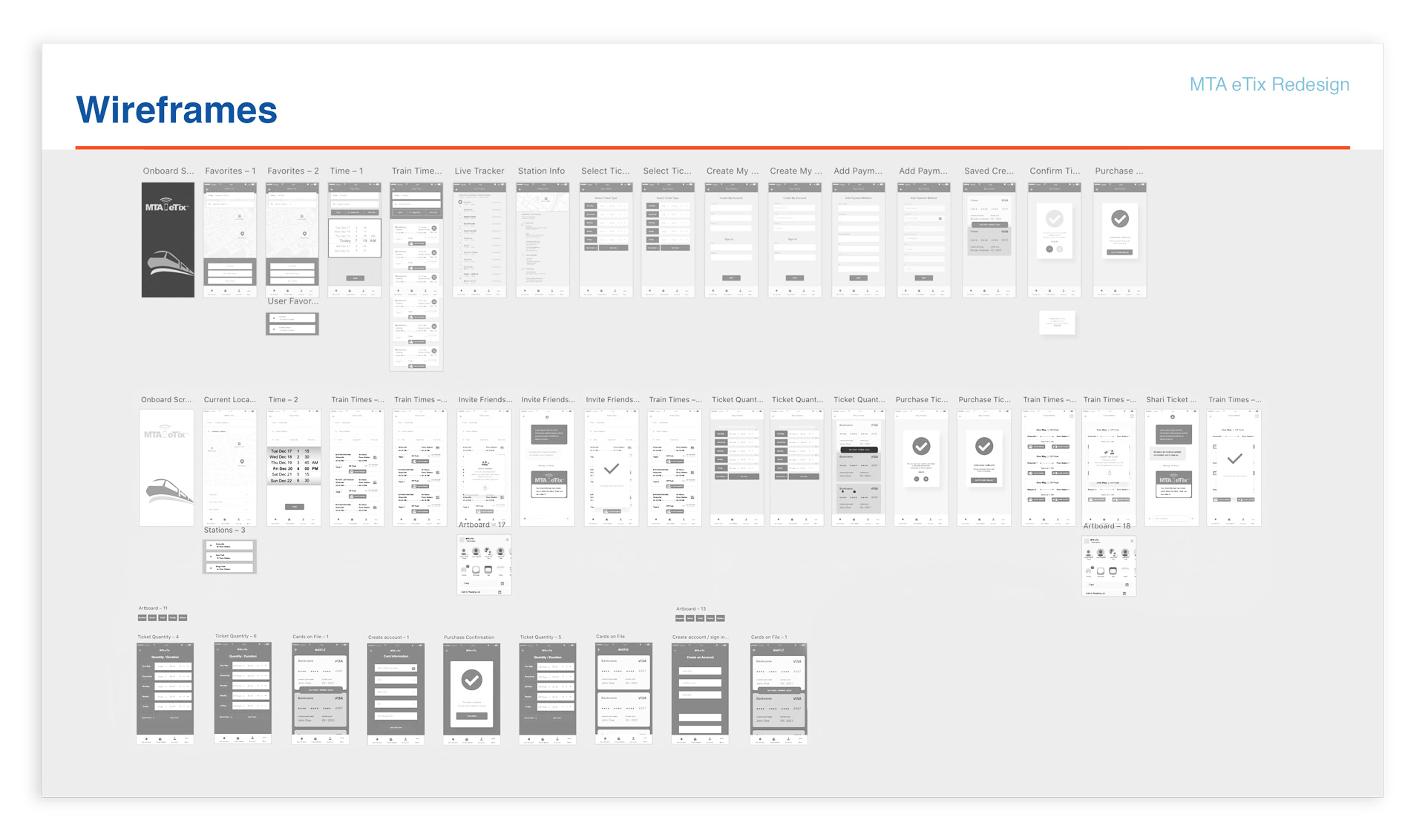
DESIGN
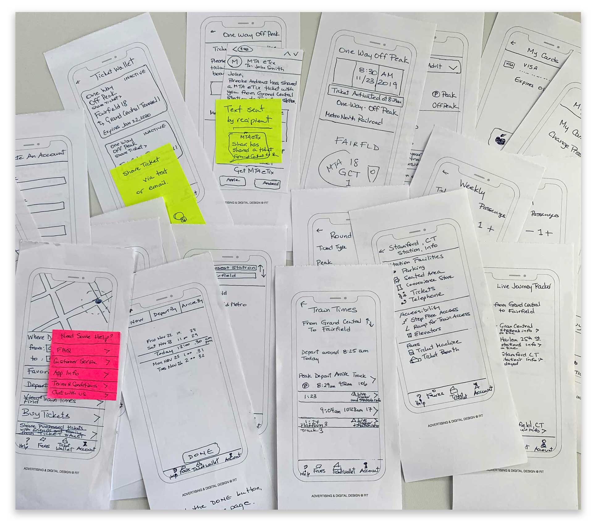
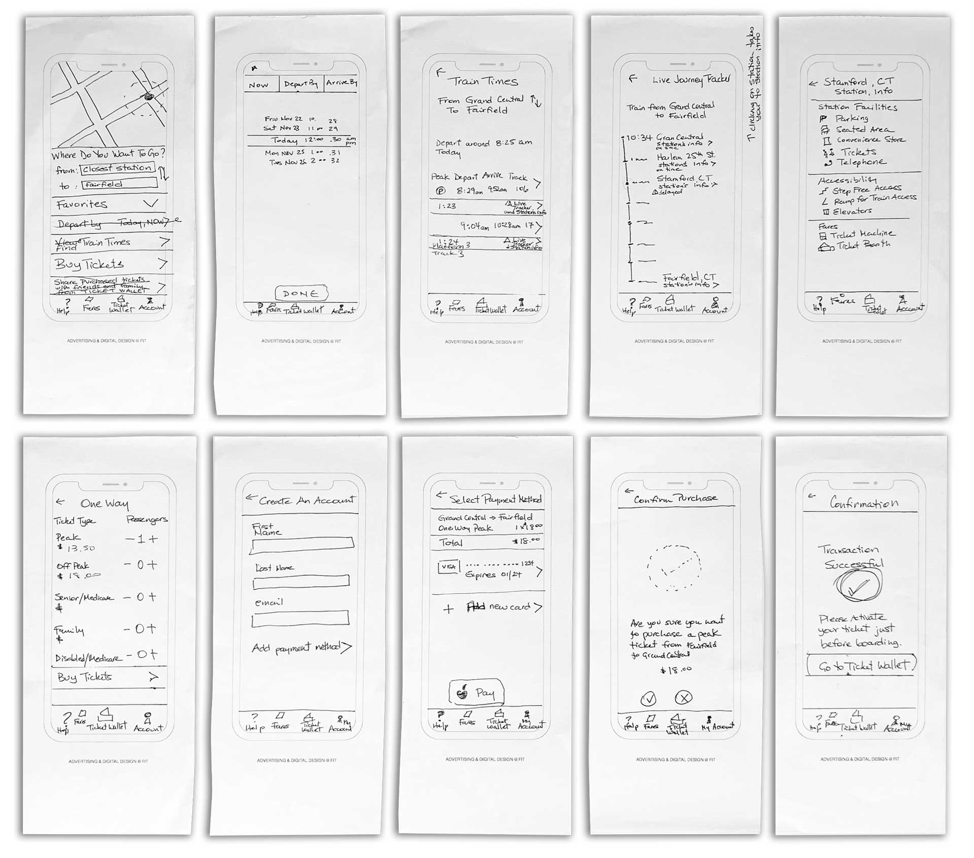
Sketching and Wireframes
With the MVPs and sitemap, we then began to sketch paper prototypes of our Task Flows. We tested them in the class with others and realized that some items were not clear to our users and therefore needed to make revisions.


Sketching
Testing
Wireframing
Testing
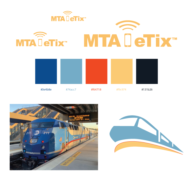
Color Scheme and Design
I designed this part of the project and made sure the colors and branding were consistent. I used the colors of the train in the image to setup the color scheme in the app’s revision and for the graphic of the train.
DESIGN
High-Fidelity Prototype
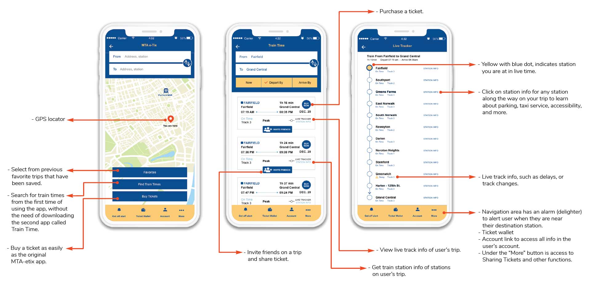
After the revision of our wireframes we each began to work on our high-fidelity prototype. We each made final changes to our wireframes and finalized our user task flow. It was important to give the app a fresh look, but keep the color scheme close to the original branding of the MTA eTix app.
This was the Task Flow I worked on, which involved : Selecting stations, viewing available train times, checking live tracker for incidents, viewing station info, and purchasing a ticket for the first time. The live tracker was an important segment based on the persona we came up with.

Before
After
Learnings
Research, research and research and put yourself in the shoes of the user. Empathy interviews are so important! From going back to my reviews at the very beginning of class, I can see how my writing was really based on my point of view as a 3 year user of the MTA eTix app. After analyzing the app, I realized how inefficient this app is for the new user. The fact that you cannot do the simple tasks of viewing train schedules and buying tickets on one app is cumbersome. When our team studied the app and we created a sitemap of the original MTA eTix app, I realized, why in 3 years I had never found, a live tracker or any station info. Learning point: Sitemaps are crucial.